The aim of this article is to highlight some user experience (UX) problems present on the web today, and provide some potential solutions. To get the ball rolling, I started a sticky note wall in the office to get a gauge what was frustrating people and offered them a chance to provide a solution! Here’s what we came up with.
Problem 1: Page load time.
It’s easy when working in a technology based business to assume that everyone has relatively decent broadband. The reality is, a large proportion of people still don’t and it’s these people that are often forgotten about when it comes to page loading time. We live in an increasingly demanding world when it comes to digital media, and we expect things to work instantly. If they don’t, the user is going to get frustrated and leave the site for somewhere else.

Source: Global internet speed 12 Aug 2015
What can we gather from this infographic?
Well, Europe is somewhere in the 15-30MBit spectrum, while it may seem fast you have to remember it’s an average. Residential areas will have much greater speeds, but some businesses in rural or industrial areas could have speeds <5MBit which is cripplingly slow. We should always build websites with the worst possible internet connections in mind, to ensure we maximise usability. That, and it’s just good practice to have a website with a great page load time.
I attended a talk recently by Ben Cooper (Front end developer at Sky) which went into page load time in some depth. Essentially, 1000ms is the ‘budget’ we have to work with. Now, that poses as quite the challenge if a website relies on media that will take longer than a second to download on a poor internet connection. So, how do we fix this? There are a couple of things you can do.
Solution: Offer the user a way out
This can be as simple as introducing a ‘skip video’ button. If the user makes a decision to interact, thinking they’ll get to the next step of their journey quicker, it’s a win. Sure, they’ll miss that awesome video you’ve made but if they aren’t receptive to watching it in the first place, it’s likely it wouldn’t have made an impression.

Source: Peugeot Catch the Dragon
Solution: Compression
There’s a great extension for Firefox that’ll reduce the size of your video considerably, without too much quality loss. So if you absolutely need to make the user watch a video and don’t want to offer a way of skipping, make sure it loads quickly. Or they’ve jumped to another tab.

Also worth a mention when it comes to compression are websites like MozJPEG / TinyPNG. You can dramatically reduce the filesize of images without too much of a hindrance on quality. A 2000px wide banner graphic that was 480KB was compressed to just 80KB using MozJPEG, which is the difference between an image loading instantly or juddering, so it’s definitely worth checking this out!
![]()
![]()
Solution: Stop-motion animation
Introducing scroll-based frame animation is an incredible way of implementing motion and interactivity into your website. Not only does this load quickly due to not needing as many frames as a full video, but it engages the user allowing them to interact with motion more intuitively.
See for yourself, the guys over at Lily have put together a neat little example.
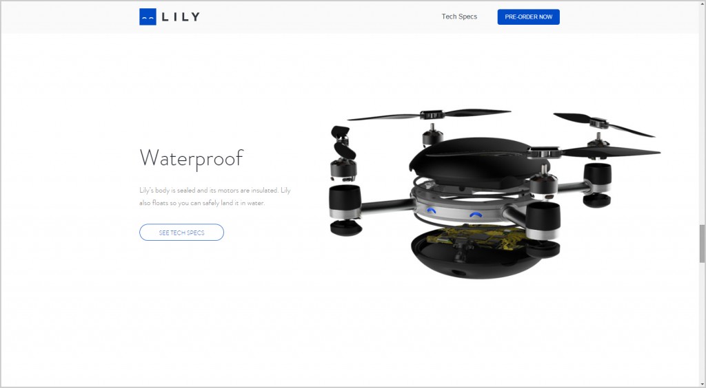
Source: Lily Portable Throw & Go Camera
Problem 2: Bland Pre-loaders.
This problem relates to the previous issue and so the same solutions apply. The UX issue here is the user’s landed with an annoying spinning loading wheel before they’ve made the decision that the content they’re waiting for is worth it. Now, if a quirky and creative animation is built into the pre-loader, it’s likely the user won’t mind having to wait at all as you’ve captured their attention.
Solution: Let the user get a taste first
Start with a still image with a play button and if the user likes the look of it, they’ll hit play. Again this goes back to my point about interaction and if they’ve made the decision to watch, they won’t mind waiting (as much) because they want to watch at this point of their journey.
You’ll have to do things this way on mobile anyway, as auto play isn’t a feature in HTML5. So to keep your desktop and mobile experience consistent, design with this in mind.
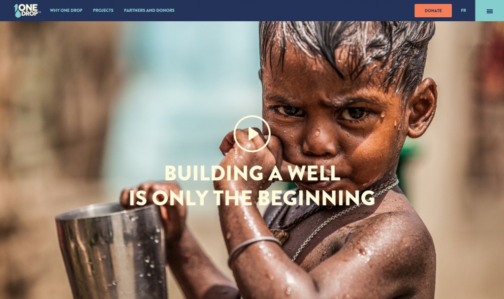
Source: One Drop
Solution: Creative Pre-loaders
Sometimes pre-loaders are unavoidable, if a website is transactional and requires interaction with a database it is likely this data processing will take some time. So, if that’s the case, why not make a feature of it as part of the design? If it’s seamlessly integrated into the web design, the user won’t become as frustrated having to wait for the page to load. It’s a good idea to incorporate a progress bar too, so your users know exactly how much longer they’re being asked to wait. This example from Banana Moon Clothing creatively blends together animated illustrations with a handy progress bar to great effect.
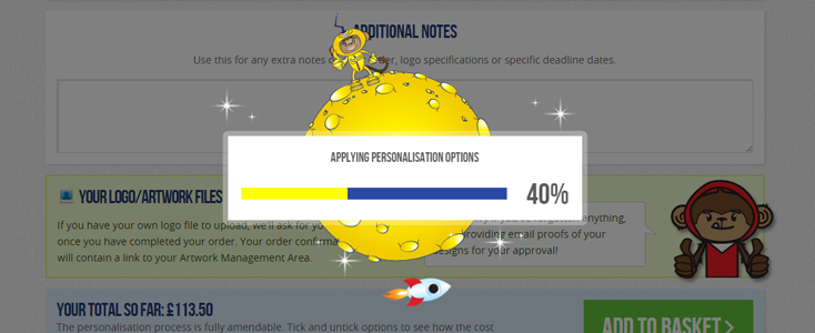
Source: Banana Moon Clothing
Problem 3: Automated Popups.
We’ve come to understand that in terms of marketing, popups are effective and actually work. That being said, when we put the user first, automated popups fail on all counts. How on earth can I provide feedback for your website when I’ve literally been on it 2 seconds? If we’re going to use them we need to do so in a way that isn’t invasive of UX. So how do we do that?
Solution: Be straight, and offer clear incentives
‘Subscribe to our email newsletter’ is a phrase I see all the time and I always think to myself, why should I do that? What are you offering me in return for my data and how do I know you’re not going to spam me or give it to someone who does? It’s safe to say that the user needs reassurance of this. Here’s an example of a great popup design: it makes use of a bold, obvious statement, reinforced by the 3 circles that show the benefits, what I need to do as a user and then a really nice touch of a personal call to action. There’s even a little disclaimer to acknowledge they respect my privacy, all bases covered.
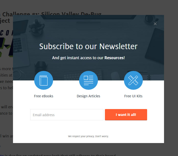
Source: UXPin
Problem 4: Struggling to navigate.
It doesn’t matter where you are on the page, it’s always a great idea to give the user controls to jump to sub-sections or indeed, another page of the site. Too often websites are designed with horizontal top navigations that don’t follow you, meaning if you’re on a rather long page have to scroll all the way back to the top just to keep reading more content. It doesn’t make much sense in the user’s journey, having to travel backwards (up the page) to make progress.
Solution: Make your navigation fixed
It’s incredibly simple to do, and means you always have navigation control regardless of page size. This can be in the form of a fixed header, sidebar or even footer. Here’s an example from the Rosenbauer website we designed – it makes a effective use of space that looks great and gives the user total control.
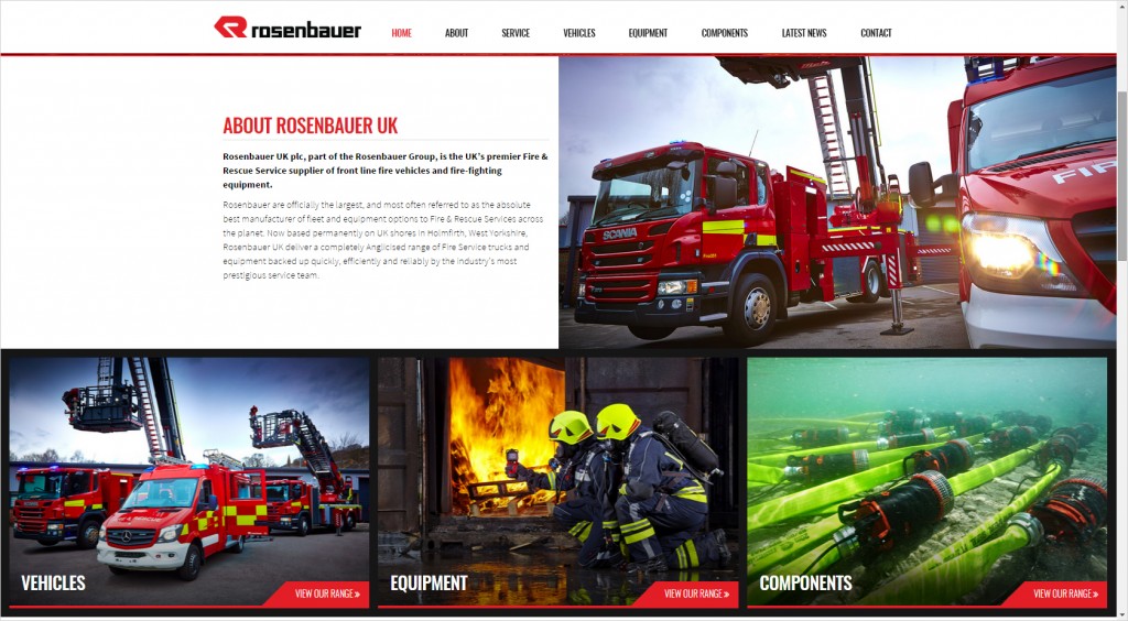
Source: Rosenbauer UK
Solution: Scroll to top buttons
These can sometimes be a nice addition to a site if fixing the navigation isn’t an option. A fixed header offers a more preferable solution, but a scroll to top button is a solution nonetheless.
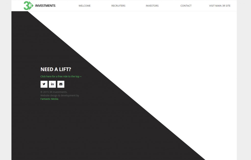
Source: 3R Investments
Problem 5: Paginated news stories
One annoying trend that keeps popping up on various news sites lately are paginated news stories. This is when you’re reading an article that says ’50 ways to improve your website traffic’ for example, and then it only posts 7 ways to do it on each page. So to read the entire article, you have to click 8 times.
The only real logical explanation as to why websites do this is to bump up the number of impressions for adverts. By doing so, however, it’s absolutely ruining the users’ experience. It’s a simple fix, but of course if a website prioritises impressions over user satisfaction, it’s a problem that I don’t see going away any time soon.

Source: LifeBuzz
Solution: Include all parts of a single post on one page
When you think about what a user wants, they want all of the content in one sitting without having to be lead down a path constantly picking at breadcrumbs to get more of the story. It makes it easier to read, easier to find specific parts and generally an easier experience all round.
Found this article helpful?
If you can relate to any of these frustrations please let us know in the comments below, start up a conversation on twitter or share with your followers on Facebook. Great design does indeed come from solving everyday problems, so the more we understand about user experience, the better we can design every project going forward!
Useful takeaways
- Try to keep your page load time down to 1000ms for maximum usability.
- Offer users skip buttons for videos they may not want to watch.
- Compress your videos with Firefogg and images with MozJPEG / TinyPNG.
- Use frame based animation for enhanced interactivity.
- Add play buttons to videos instead of playing them automatically.
- Design creative pre-loaders seamlessly into your loading screens.
- Be straight and offer clear incentives when it comes to popups.
- Make use of fixed navigational elements for a smoother user journey.
- Put your users’ needs first and avoid paginated news stories.