Welcome to the first post in a series of 10 where we’ll be looking at digital trends, why they’re popping up and the benefits to users.
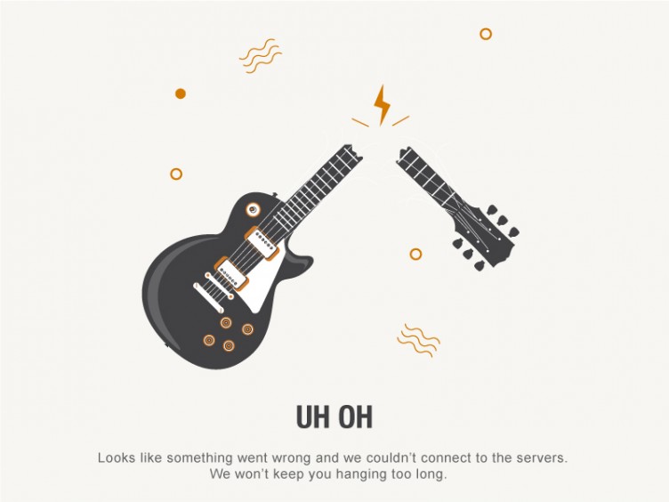
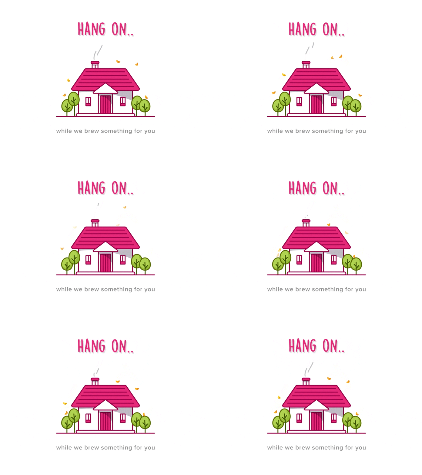
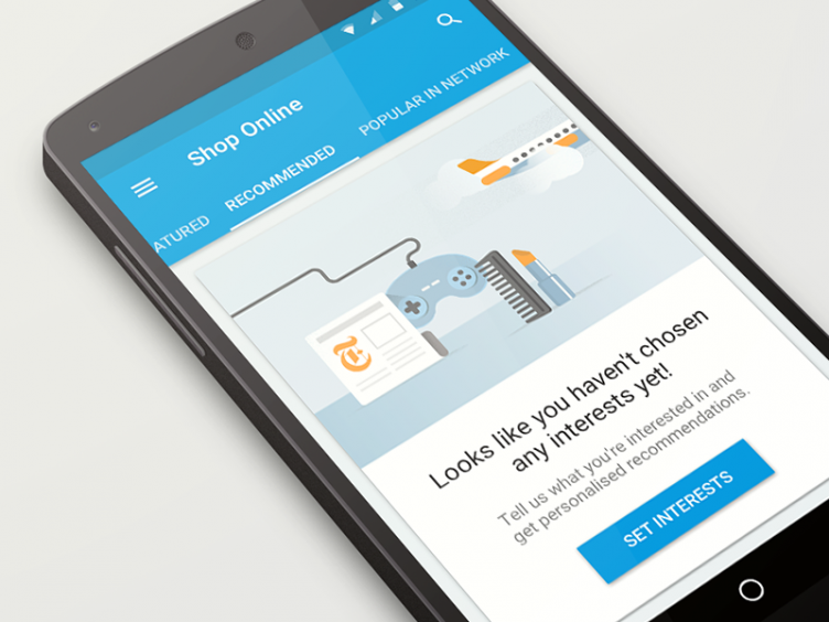
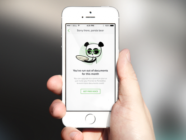
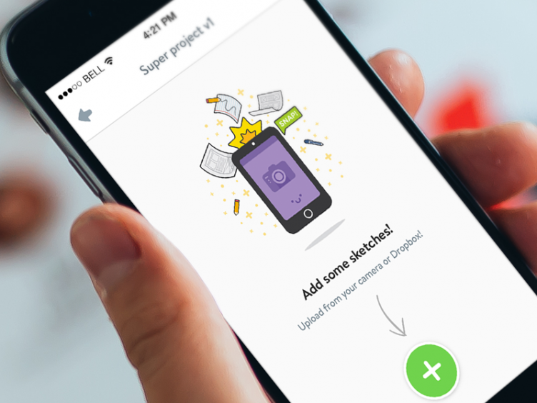
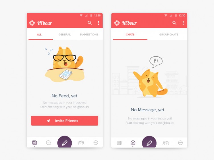
To kick things off I’ve gathered some awesome examples of some empty state design. Empty states are the pages that exist before you begin adding content to an app/website, but also extending into the realms of 404 (error) pages on the web. They’re often an overlooked part of the Internet, but play a bigger role within the app world as part of the onboarding process.
Nobody spends any time on these pages, why bother?
We’re not disagreeing. Users will definitely spend more time amongst the core sections of your application but this is the ‘shop window’, so to speak. It’s a chance for you to make a great first impression. There is definitely justifiable value in that, so we think it’s worth spending that extra bit of time to create something that captures the user’s imagination, evoking an emotional response.
We’re starting to see designers use this space to be creative with illustration, animation and even humour. If you have the right brand, it gives you a chance to let its personality shine through in a bold way. So the next time you’re designing a basket for an e-commerce page, a news section that has no stories or an app where you *really* want people to click the ‘get started’ button, don’t forget about the almighty empty state.
Thanks for reading, now here’s some pictures of cats!
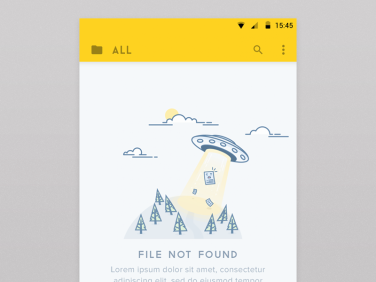
File Not Found by by Iftikhar Shaikh
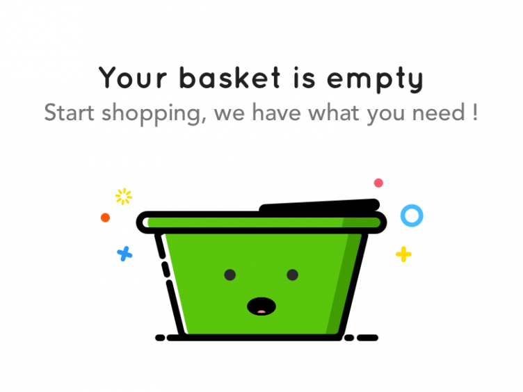
Shopping Basket by Aurélien Lepage
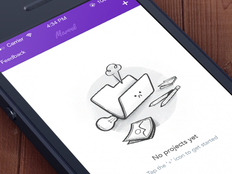
Marvel iPhone App by Murat Mutlu
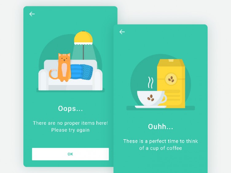
Empty state screens by Katya Dihich
Interest Empty Data by Barbara Giardelli
Empty State Screen – PandaDoc for iPhone by Eugene Nevgen
