Digital Trends Part 1: Empty State Design
Typography in web design is becoming more and more sophisticated each year. There’s no question that designers have a love for beautiful lettering, and platforms such as @Font-face and Adobe Typekit make it possible to bring the amazing qualities of print design into the digital age with ease. This article is dedicated to websites that have worked different typographic combinations together beautifully, and provide inspiration for you to try something new in your next project! The following examples have been identified using the Chrome extension WhatFont. If you’re interested in knowing which fonts websites are using, this extension is a must – go check it out.
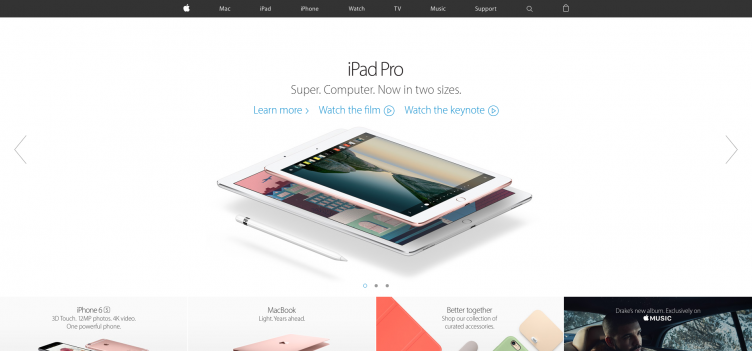
10. Apple.com
Myriad Set Pro
We’ll kick things off with Apple. This is one of the most desirable brands on the planet so they must be doing something right. It’s interesting to see their approach to typography being a ‘one font fits all’. So the headings, sub-headings and paragraph copy are all using the same typeface. The way they’ve utilised different font sizes to create a heirarchy elegant and simple. Often it can be too much when too many different typefaces are going on at once, so to see Apple have stripped it back to only use the one makes sense. Their typography aligns with their brand values as you see this applied to their electronics all the time.
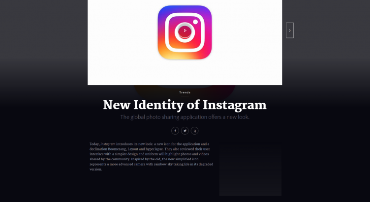
9. Fubiz.net
Merriweather Heavy, Source Sans Pro Light & Merriweather regular
If you haven’t heard of Fubiz, go check it out – it’s a brilliant source of inspiration for creatives. It’s interesting to see a trend of serif fonts having more of a place within web design, especially for websites where reading lots of content is paramount. Serif fonts are more defined than sans-serif, so this makes them perfect for using in large blocks of paragraph copy to improve readability. Fubiz have used a mixture of serif and sans-serif to create heirarchy and overall it looks creative and slick.
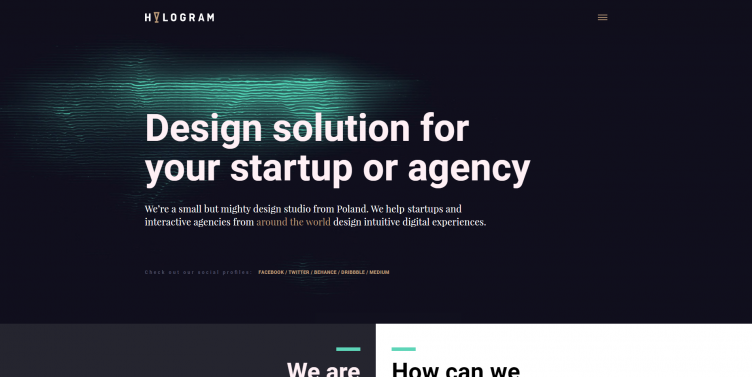
8. HologramDesign.co
Roboto Bold, Playfair Display Regular & Roboto Regular
Roboto – if you’re familiar with Google you’ll know it’s their go-to font as well. However, here you can see Hologram Design have used it for a big, bold headline and then switched to serif for sub-headers & paragraphs. They’ve gone a step further with the heirarchy too, so smaller less important text is in Roboto Regular with a wider kern (or letter-spacing, if you’re more into the CSS terminology). This combination has quite a bit of impact I’d say!
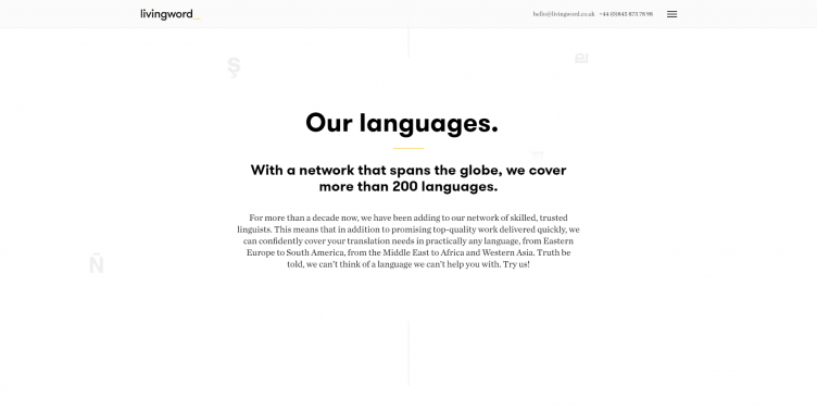
7. LivingWord.co.uk
GT Walshelm Bold & Chronicle Text G1 Roman
It’s clean, fresh, and oozes Swiss design style. One thing I admire about this website is the complete lack of imagery for the homepage. These guys care about speed and optimisation, and demonstrate how if you put a lot of effort into setting up the typography properly, there’s less of a need to fill the page with heavy imagery. Their messages come across loud and clear and they don’t make their users wait around staring at pre-loaders to load in videos they may not even want to watch. This is efficient web design.
6. Uber.com
FF Clan Web Pro
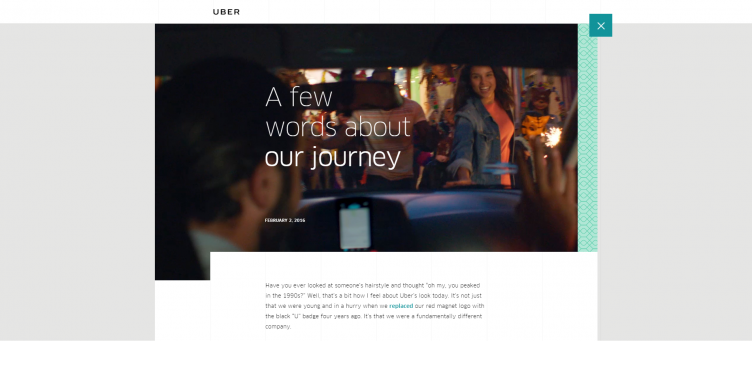
You could say Uber have taken a leaf from Apples book here as they’ve also applied the ‘one font fits all’ approach with FF Clan Web Pro. Headings are big, bold and sit above imagery of people using the Uber service, then where there’s a larger quantity of copy they make sure you’re reading it on a solid colour background for easier readability. Uber seem to be going through a bit of a transitional stage at the moment with their brand, as they’re experiencing such rapid growth. It’s interesting to see how they’re evolving their brand to match this growth.
5. Viens-la.com
SimploW00 Black, Yellowtail Regular, Gotham Bold & Archer Book Italic
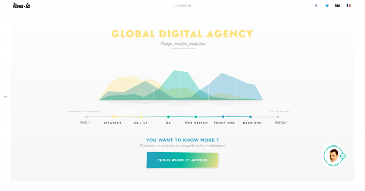
These guys have gone for four different fonts here. A bit too much? You could argue. But they’ve done so all on clean, white backgrounds… ensuring readability isn’t affected too much. The large headlines sit alongside Yellowtail, a hand-written typeface that allows them to convey aspects of their creative personality as an agency. What’s also important is that this is actually a French website that Google has auto-translated into English for me, and the design doesn’t suffer one bit. Sometimes when translating websites it can break the layout – so it’s great to see these guys have taken this into consideration and have designed something that can be enjoyed internationally.
4. Whiteboard.is
Merriweather & Calibre Web
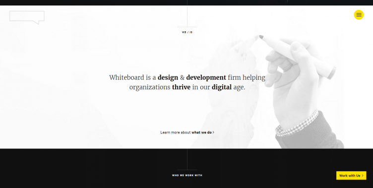
Another advocate of Merriweather! Again, in the creative industry. It’s a great typeface to use for headings as it offers a professional look and feel. Calibre Web is a nice sans-serif font that complements Merriweather well – also continuing the trend of serif/sans-serif pairings being used effectively on the web.
3. NurtureDigital.com
Abril Fat Face, Abril Display & Aktiv Grotesk
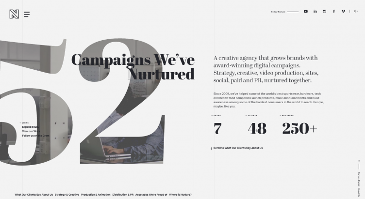
Now this website has somewhat of a modern, yet vintage feel to it. They’ve used typography incredibly well by masking videos inside across the whole site for an incredibly creative look and feel. You’ll notice a lot of these examples are from design agencies – as I think they’re more inclined to try harder in order to stand out and appear unique. Nurture have definitely achieved this, and the three fonts they’ve gone for work together beautifully… and that’s why it gets into the top 3!
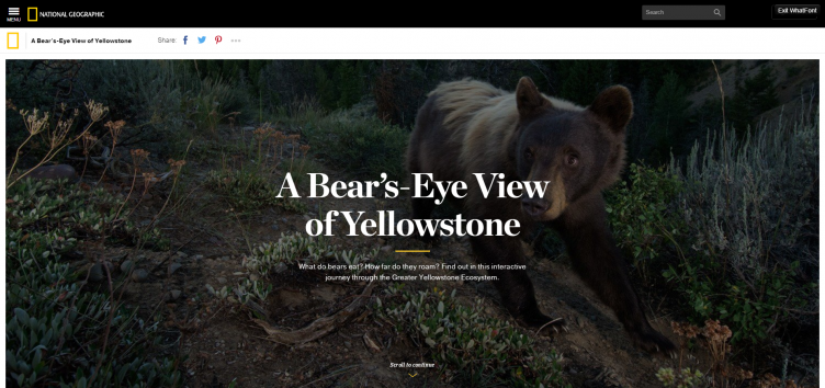
2. NationalGeographic.com
Chronical Display 7r, Pragmatica Web & Georgia Italic
National Geographic have my top spot for a large, serif display font with Chronical Display 7r. It’s both bold, easy to read, professional and creative. It sits on top of this video beautifully! I quite like how they’ve used a simple italicised font to communicate action across the site too. Top work.
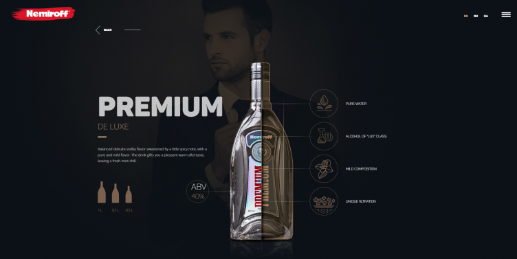
1. Nemiroff.vodka
Panton Bold, Panton Regular & Open Sans
In at number 1, and rightfully so has got to be the Nemiroff Vodka website. This is an incredibly premium vodka and they’ve managed to convey that with the use of the Panton font family. Switching between Bold / Regular for the display / sub-headings works surprisingly well. Just look at that ‘M’ character. Now you just know whoever designed this font has a love of typography!
I think that rounds things up nicely. If you have any other typographic combinations that you’d like to share feel free to let us know in the comments or on Twitter! @fantasticmedia. Thanks for reading!

Pingback: Digital Trends 2016 - Virtual Reality | Fantastic Media()