The most beautiful website in the galaxy.
It’s no secret in the office that I’m a huge fan of Star Wars (I mean, who isn’t?) and I’m pretty excited for Star Wars Battlefront when it gets released on the 19th November. I’m even more excited for the new film next month, but that’s a whole other story that I’ll write about another time.
This post is dedicated to complimenting the user experience designers that have crafted something truly out of this world. The Star Wars Battlefront Planets Experience. The way in which the website has generated such a powerful emotional resonance with me is the reason why I’ve decided to write about it. I will analyse the anatomy of the design & development decisions that have been made to highlight why it works so well.
For optimum enjoyment when reading this article, I strongly recommend listening to this movie soundtrack so that you’re completely immersed in the Star Wars universe.
Okay now you’re ready. Awesome. Let’s begin.
Effective storytelling
The first thing you’ll notice is the use of a hugely immersive full screen video that starts automatically and gets you right into all of the action, as if you’re playing the game. The user browses the page by hitting continue which plays small snippets of gameplay footage and then pauses to offer up specific details. This is great for the user, because they don’t have to look around to begin their journey. It’s handed to them on a plate, all they have to do is click a single button to be taken on their way. Simplicity at its finest.
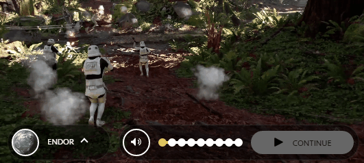
Sub-navigation that gives the user control
The controls that they’ve opted to go for is a timeline approach, which updates as the video is playing to show you the point in which you’re at in your user journey. This is great UX as you know roughly how long it’s going to take to explore each planet.

Simplified content structure
This whole section is rich with content including weaponry, characters, vehicles, level design, game modes and even footage of the real world locations that the game is based on. It sounds like a lot of content to include, and it really is. The way that it’s been structured though means you only ever see snippets of information at any one time. This is extremely effective as you don’t want to bombard the user with too much information at once. The information then loads in a non-intrusive popup so it’s super quick to find out more without having to visit another page and wait for it to load.
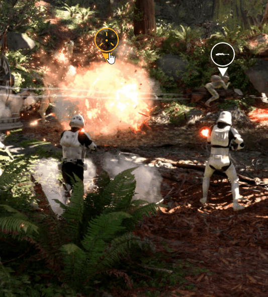
Top tip: notice how the icons change colour after you’ve :visited them, meaning you get a sense of progress if there are multiple details on a page, as well as knowing which ones you have and haven’t clicked on. Very basic development, really well executed.
Powerful video content, and lots of it
When it comes to digital content consumption, video is usually the best option for the user. Click here to view stats on using video in marketing. The clips used on these pages are incredibly short (under 30 seconds) but still rather engaging. Keeping them short and sweet is the perfect way get the user excited about the game, whilst still bearing in mind that one of the goals is to get them back on their journey of exploring more of the planet.
Top tip: when working with short videos, auto-looping can be a great feature so that the user doesn’t have to click replay if they decide they want to watch something again.
Clear and concise calls to action
It’s extremely useful for the user if they’re faced with clear calls to action once they’ve reached the end of their journey. The example below gives the option of exploring the other planets without going back to the landing page, telling your friends on social platforms in a single click, using powerful emotive language to incentivise signing up to the newsletter and then of course, pre-ordering the game. All these options housed nicely in a distraction-free window. Awesome design.
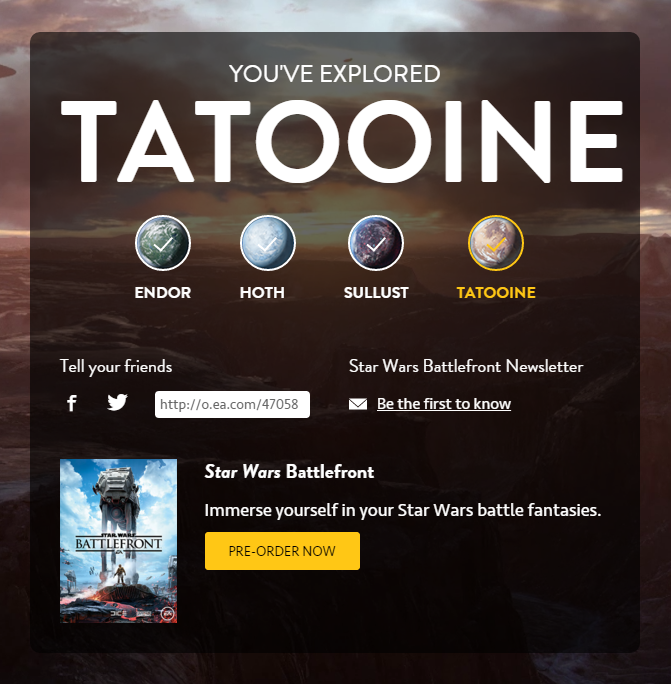
Top tip: use tick icons to establish a sense of progress or achievement and encourage the user to complete the other options.
Useful takeaways
I think that pretty much wraps up the review. I could probably go into a lot more detail about why this is a brilliant experience but I wanted to keep this article relatively short. So here are a few of the key points for you to take away.
- Turn your content into a story, and then tell it to the user in a creative format.
- Offer the user intuitive navigation controls that gives them flexibility and freedom to explore.
- Consider using popups as an effective way to manage the structure of content, especially if there’s a lot of it to work with.
- Use video content wherever possible to maximise user engagement.
- Design awesome calls to action that make it clear exactly what you want the user to do when they get to the end of their journey.
Thanks for reading this article! I hope you’ve enjoyed it. This is the first UX review in the series so expect more to come in future. Let me know what you think in the comments below and don’t forget to share it with your followers if you think they’ll find it useful.
Side note: if you’re a PC gamer and would like to help me take down some AT-AT’s on planet Hoth, feel free to add me as a friend on Origin. Username: tyrantq3.

Pingback: Digital Trends 2016 - Virtual Reality | Fantastic Media()