Batman or Superman?
This question has divided fans for decades. On one hand you get team Batman, ordinary man with no super powers that is able to kick a** in the streets of Gotham with nothing but sheer determination as his power. Then there’s team Superman, who think it’s ludicrous to even compare the two as there’s nothing super about Batman at all and they aren’t even in the same league. Well, that’s all about to change. The upcoming film Batman vs. Superman (released on the 25th of this month) is about to turn a few heads, and maybe shock some fans…
Here’s the trailer if somehow, you haven’t come across it yet…
Introduction
In this article we’re going to look at why brands change their logos over time, when it’s a good idea and when it’s not always the best idea. We’re going to dive straight in and check out how the Batman logo has evolved since the 1940’s to the present day.
Batman: Logo evolution
It’s possibly one of the most iconic logos of all time, and it’s changed for pretty much every new film that’s been released over the years. Why do you think this is? Is Batman having some sort of identity crisis? Probably not. I think it’s a case of film producers wanting to put their own stamp on their interpretation of what Batman is all about. The logo has remained unchanged really, in the core message that it’s communicating, but its execution has changed slightly. Just enough to remain fresh, but not too much that people aren’t aware of what it is anymore. It truly is a creative evolution that ticks all the boxes for me, every iteration becoming an improvement on the last. Movie special effects technology is getting more and more cutting edge each year. Therefore, the film crews can show Batman in an even more exciting light each and every release. Having a logo to sit alongside this is nothing short of impressive.
Superman: Logo evolution
I believe a lot of what I’ve said above for Batman, applies for Superman too. You can clearly see how the logo iterations only change slightly each time. Fans need to be able to quickly identify with a logo and when they change too much, it throws in an element of confusion into the mix. For example Superman’s Electric Blue logo or the House of El, deviate away slightly too much for me as they lose their instant recognition – but overall were effective in communicating how those renditions of Superman were different to the original classics.
The Fantastic approach to branding
When people think branding, immediately the logo is the first thing that comes into people’s minds. It’s the most obvious form of conveying your brand’s core values in a split second. We’ve also noticed that it is a strong driver for audience engagement as it lets people voice their opinions. It gets people talking.
So when is it a good time to update your logo?
It really does depend on the client. Is it a fashionable brand that needs to keep up with design trends? Ie. Starbucks, Apple, Pepsi, Uber etc. Or is it a brand that needs to change the way it’s perceived by its customers? The latter is one we have quite a bit of experience with, for example the brand ‘Answering 4 U’ and how we re-branded it ‘Your Business Voice’.
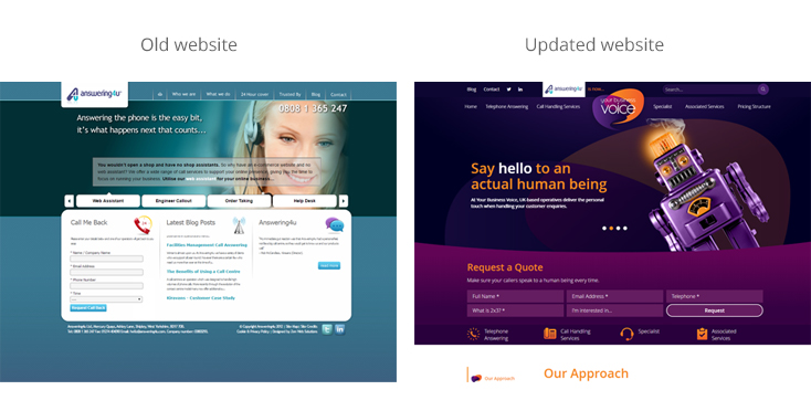
Case Study – Your Business Voice
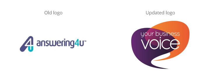
It’s not every day that a brand requires a complete overhaul. Answering 4 U came to us wanting to develop their current proposition, and we felt their logo & website weren’t really communicating the depth of their service offering effectively. They are a company that offer so much more than just telephone answering, so we came up with a logo, website and various other marketing media that got the message out there for them more efficiently.
Click here to visit YourBusinessVoice.co.uk
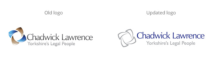
Chadwick Lawrence
The old sand colour complements the blue, but was a direct link with the personal services / business services the company offers so wasn’t working in isolation for advertising. The refreshed version takes a brighter, neutral approach which communicates a more modern, confident business that is innovative and approachable.
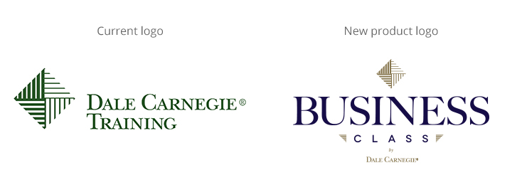
Dale Carnegie Business Class
A little different to the others –Dale Carnegie© Training wanted to create a sub brand for a loyalty programme that was developed for existing customers. As an added value proposition building on a highly established brand, we needed to ensure there was synergy with the main brand mark while still conveying the aims and objectives of the Business Class programme. With this in mind, gold and royal blue were chosen to communicate the premium nature of the service with the new brand alongside connotations of air travel which formed part of the brand proposition.
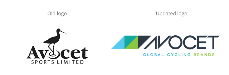 Avocet Sports
The new Avocet logo introduces groups of triangular shapes taken from the inner sections of a bike frame. We were then able to use these on a range of media as a creative device to give the brand more character. For Avocet’s sub-brands, we can also inter-change these colours to give each sub-brand it’s own unique look and feel.
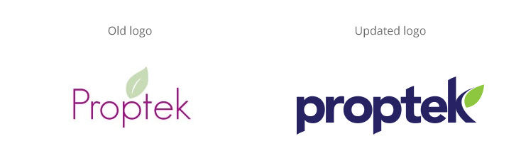 Proptek
The old Proptek brand wasn’t really standing strong enough on it’s own, and when working with small scale prints it was getting lost a little too easily. By bulking the typeface up a little, we’ve given the logo more impact and strength. We thought there was value in the leaf device, so worked this seamlessly into the ‘k’ for a modern look and feel.
Conclusion
It’s a big decision when it comes to updating your logo. You have to consider a number of factors before deciding whether it’s the right thing to do or not. The best logo updates stay true to a company’s traditions but only slightly tweak the design to bring the brand into the modern era/different sector. There’s always a risk when completely changing a brand, that the current customer won’t be familiar with the company anymore and lose brand equity. However, if a company drastically changes its offering and wants to tap into a different sector/core customer – it’s okay to do so in this instance.
I hope you’ve enjoyed reading this article and would love to hear your thoughts on some of the projects we’ve talked about here – feel free to jump to the comments area below and let us know!