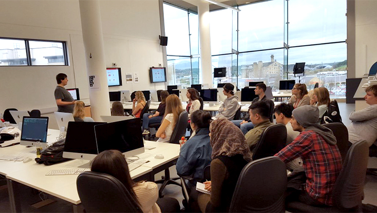
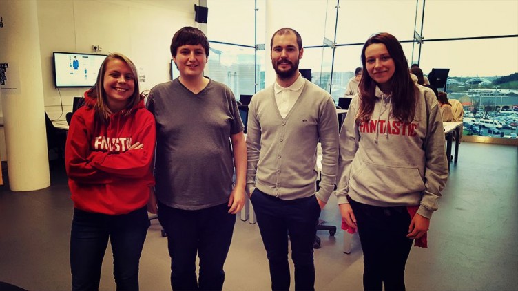
Last week, Miles and I attended the University of Huddersfield to give a presentation and workshop on User Experience and The Journey to Conversion. This was a website design workshop that focused on the following: creating personal user profiles & stories, website analysis of barriers to conversion and then went into potential experiments for suggesting improvements to real world websites.
Workshop Introduction
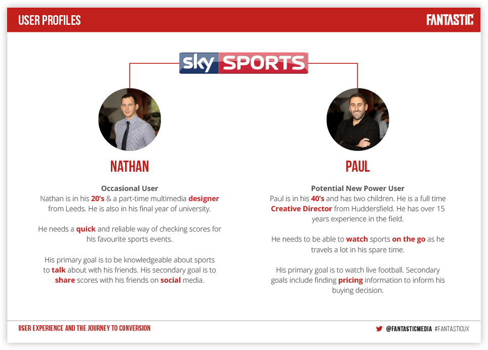
I introduced the workshop by presenting how we would carry out this process at Fantastic. I explained how to put together a basic user profile by storytelling and presented two examples for the Sky Sports website. Here are the results:
User Journeys, Barriers to Conversion & Experiments
We set the scene by generating a user journey from Nathan’s perspective to go through the website, get the latest F1 Grand Prix results and share them with his friends on Facebook. By putting myself in Nathan’s shoes and making notes about the elements of the site that would frustrate him, I was able spot issues I may have missed otherwise. I then explained how we would take these frustrations, or barriers to conversion, and suggest experiments to improve UX through design.
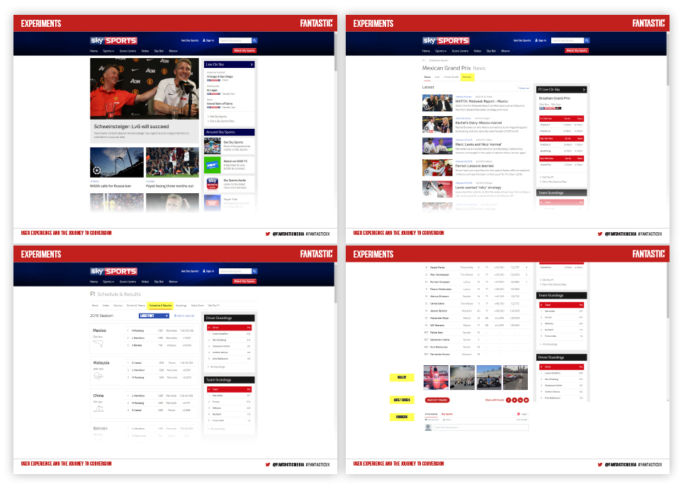
Possible experiments Sky Sports could run to improve Nathan’s experience.
Click here to download the Fantastic UX Slide deck (PDF).
Student Workshops
The students were given websites including DW Sports Fitness, Debenhams and Just Eat. Each team then analysed the sites for barriers to conversion and really got stuck into putting themselves in the mindset of the user. It was great to see the students having such a high level of engagement and enjoying the process, and here’s a summary of their findings.
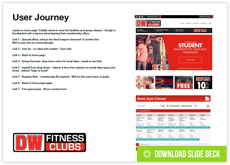
Group 1: DW Fitness Clubs
In this presentation we follow Jane, a woman in her early 20’s that’s interested in losing weight by attending social exercise classes and groups at DW Fitness Clubs.
These students acknowledged the following problems and solutions:
- Class information wasn’t easy to find and often meant the user had to loop back to the homepage and start multiple journeys of discovery before finding the right route.
- By means of A/B testing they suggested to make a clearer path to reach the classes page, reducing the amount of clicks required
Reducing the amount of clicks needed to reach conversion will always be a huge benefit to the user – so good job in spotting this!
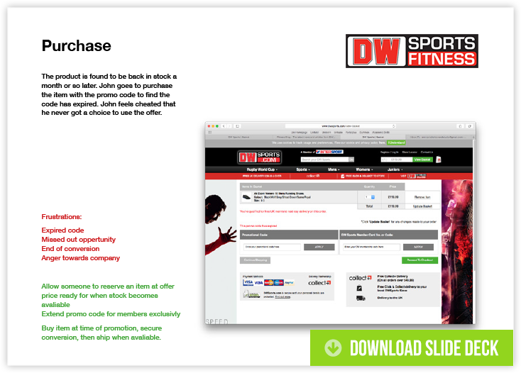
Group 2: DW Sports Fitness Shop
This user journey puts you in the shoes of John, a 42 year old financial consultant who’s a long term DW gym member. He’s interested in having an extensive gym wardrobe keeping up with trends and his buying decisions are influenced by promotional codes.
These students understood that John’s journey would begin at the email marketing stage, with him being on the mailing list to receive offers.
These students tried to use a promotional code at the checkout only to be frustrated to find out it had expired. They then came up with a great idea to extend promo codes exclusively for members, and most notably for products that were out of stock. This would definitely increase conversion as members would be able to get the products they want, for the price they’ve been advertised. Good work guys!
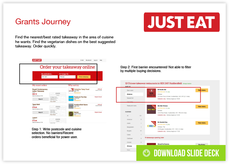
Group 3: Just Eat
The team analysing the Just Eat website used their housemate, Grant, as their user profile. Grant, labelled a ‘power user’, is age 20, vegetarian and orders once or twice a week. He needs to meet the free delivery requirements and find the vegetarian options quickly.
One barrier these students picked up on was the lack of ability to find restaurants based on multiple buying decisions; e.g. takeaways sorted by distance and rating simultaneously. It also wasn’t clear enough to spot vegetarian options quickly, negate search results if restaurants are closed and offer order tracking to give the user more knowledge about how long their food will take to arrive. Some brilliant suggestions here that would make a big impact, excellent teamwork!
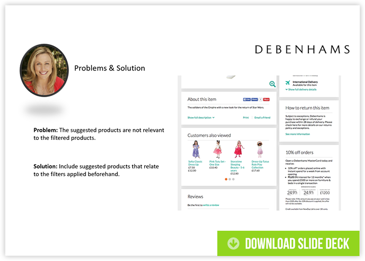 Group 4: Debenhams
This group came up with three very different profiles, which in turn highlighted 3 different journeys through the website. These students spotted that quick views in e-commerce will improve experience, adding in filtering options that the users actually need to refine product selection, and offering similar products that are related to your current refinements. These are all common issues that are prevalent on a number of ecommerce websites today and it’s great that they’ve highlighted them and provided solutions. Top work!
Conclusion
On the whole the workshop was a huge success, with a great level of engagement from the students. We hope they enjoyed it and expect to be back at Huddersfield again soon! Fantastic prides itself on our relationships with universities as there are several staff members who began their careers here with a placement. With this in mind, we’re always on the lookout for talented individuals; so if you’d like to apply feel free to send your CV and digital portfolio link to digital@fantasticmedia.co.uk – Cheers!